Project Overview
The product:
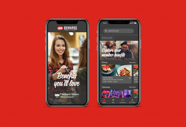
The Entertainment App is an app that provides Entertainment members with exclusive offers on dining, travel, shopping, and more. The typical user is a female between 25 to 45 with a family. The goal of the Entertainment App is to provide members with a wide range of offers, allowing them to discover more about their local community and save money in their everyday lives.
The Problem:
Customer reviews reflected that members are not satisfied with the Entertainment app. Some members are still asking to bring the Entertainment book back.
The Goal:
Improve the User Experience of the Entertainment app to drive engagement and increase transaction value.
My role:
UX UI designer leading the redesign of the home screen.
Responsibilities:
Gather feedback from current Entertainment app users. Produce high-fidelity mockups.
User Research
Pain points:
1. Look and Feel – “App design looks old, outdated and clunky.”
2. Browse – Lack of option to see all offers, users want a master list of all offers like the book.
3. Explore – Difficult to explore and navigate what’s in the program.
Starting the design
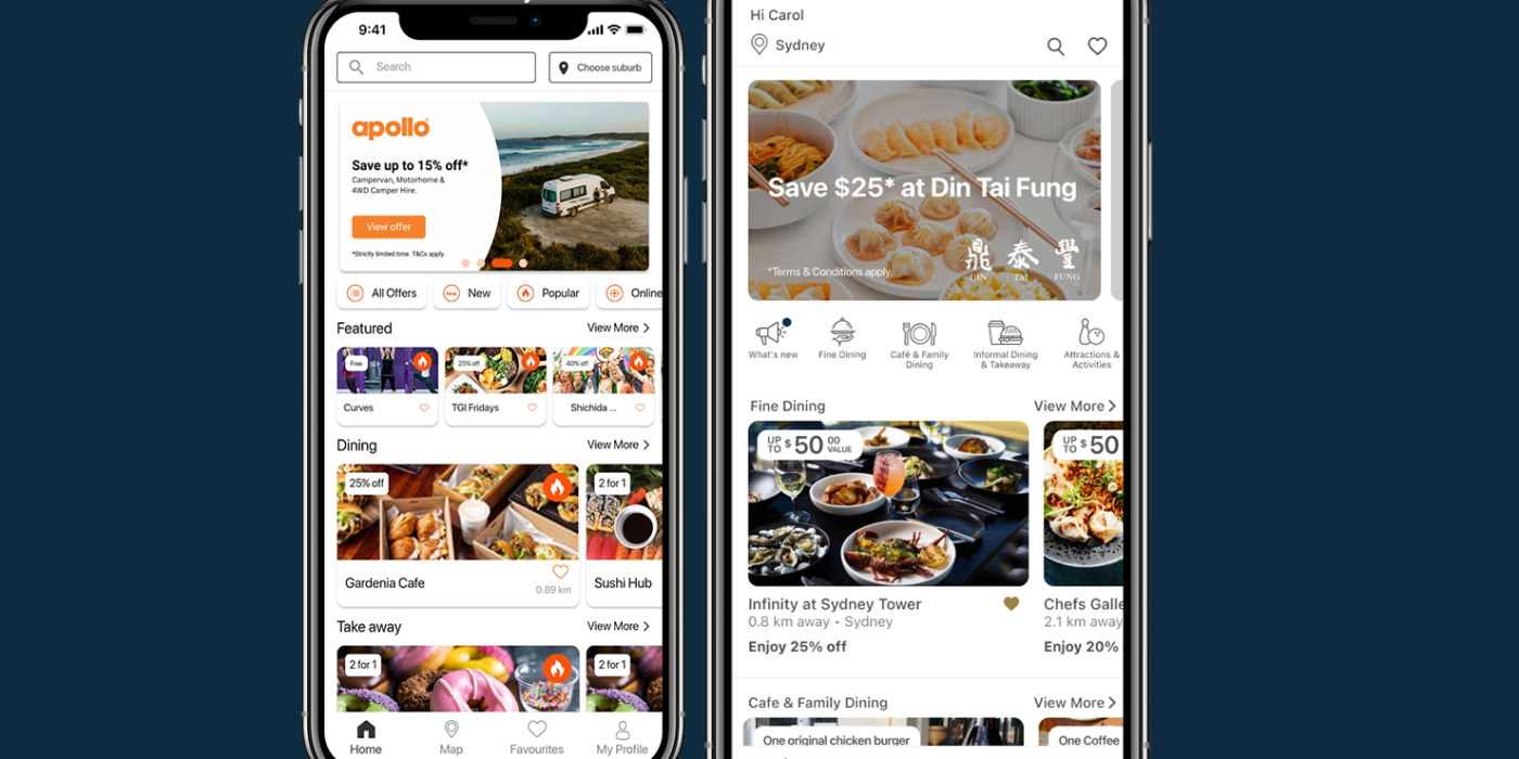
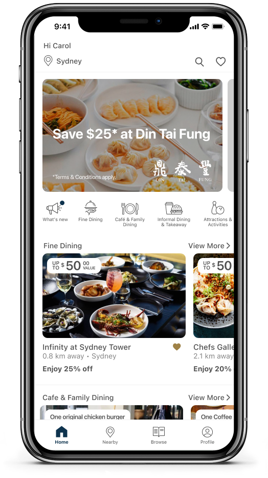
Round 1 mockup
- Added category shortcut icons for easier visual recognition of available offerings. Solving the difficult-to-explore pain point.
- More white space all around to give content room to breathe, improving readability and focus.
- Adopted a more neutral colour palette to improve the look and feel of the app. Primarily shades of grey with subtle accents of orange, to create a refined, premium feel and allow the content to take centre stage.

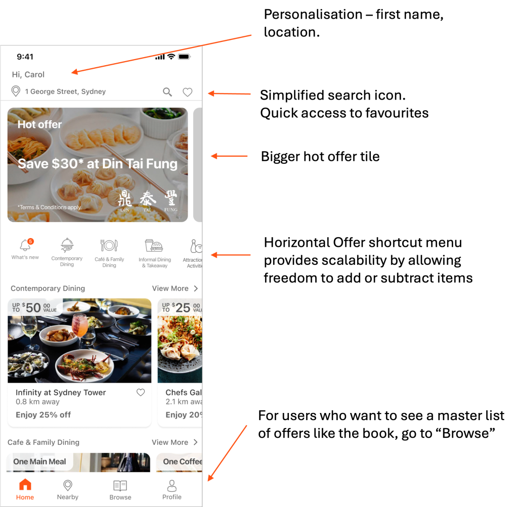
Round 2 mockup
After the first round of user feedback, I made further changes:
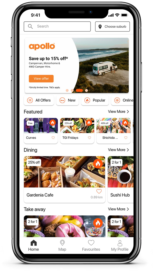
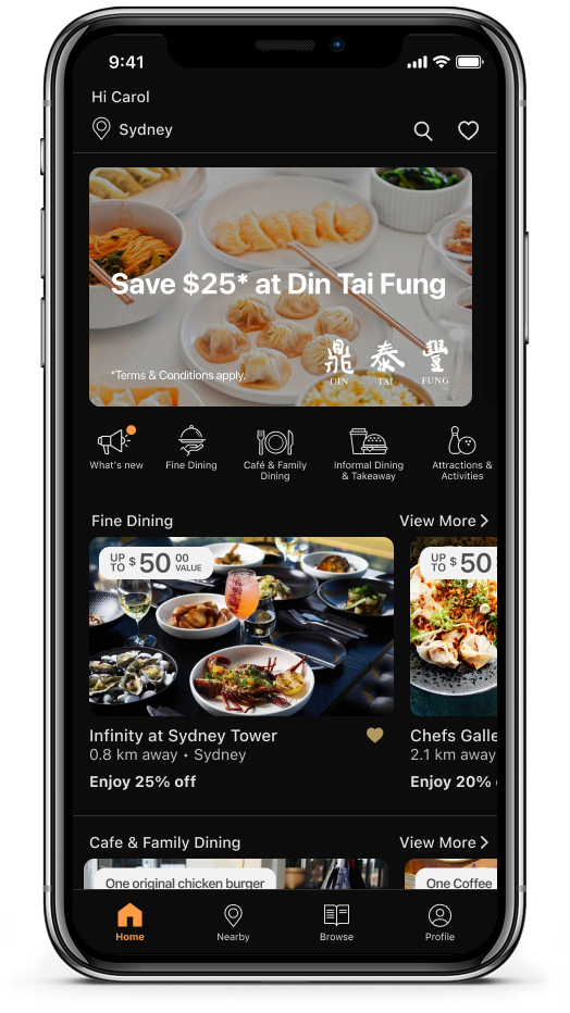
Round 3 mockup – Final:
We’ve refined the offer card with rounded corners and adjusted the ‘Up to $XX value’ tag to use 100% white for improved accessibility.
Since then, the business has updated its colour palette to Marine Blue and Gold. A lighter orange has replaced the previous bright orange and will be used in dark mode.”

What I have learned from this project
To communicate my solution to the stakeholders, I must put effort into explaining the reasoning behind my design. I have found that creating a mockup of both their initial suggestions and then presenting my recommendation helps this process.
The executives were looking to display all categories’ shortcut icons on the home screen. After seeing their idea and my recommendation together in the Round 2 mockup, they can visualise and understand which one is a more suitable option for the users. I believe that it’s important to be included in the decision-making process.