Project Overview
The product:
Entertainment Membership is a program that provides members with exclusive offers on dining, travel, shopping, and more. Memberships are usually sold through fundraising activities. The typical user is a female between 25 to 45 with a family. The goal of Entertainment Membership is to help fundraisers raise money for their causes while helping users to save money in their everyday lives.
The Problem:
New visitors are visiting the Entertainment Membership website, but they tend to bounce after spending only 30 seconds on the Membership subscription page. Visitors are confused about what the Entertainment Membership offers and do not immediately see the value of purchasing a Membership.
The Goal:
Design the Membership Subscription webpage to emphasize the value of the Entertainment Membership and improve the conversion rate of visitors purchasing the Entertainment Membership.
My role:
UX UI designer leading the redesign of the Membership Subscription webpage.
Responsibilities:
Gather feedback from current website users. Produce high-fidelity mockups.
User Research
Pain points:
1. Unpolished and dated design – The design of the product cards looks dated and cluttered.
2. Cognitive overload – there are too much information presented to users and content is too text heavy.
Starting the design
Round 1 mockup
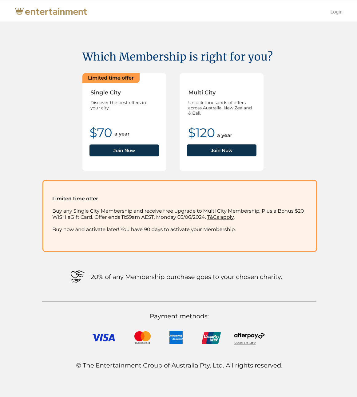
- Personalised the title by asking the visitors Which Membership is right for you? This is to drive the user’s interest to the information below.
- Replaced the black-and-white colour theme, sharp corners, and shadowing to create a more minimalist look and feel. Incorporate more white space, rounded corners, and left alignment to upgrade the page with a modern appeal.
- A separate text box is placed below the product cards to provide more information about the limited-time offer, allowing visitors some space to digest additional information if they are interested.
Round 2 mockup
After the first round of user feedback, I made further changes:
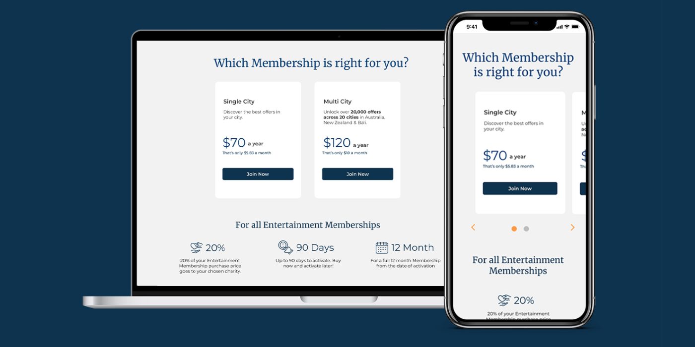
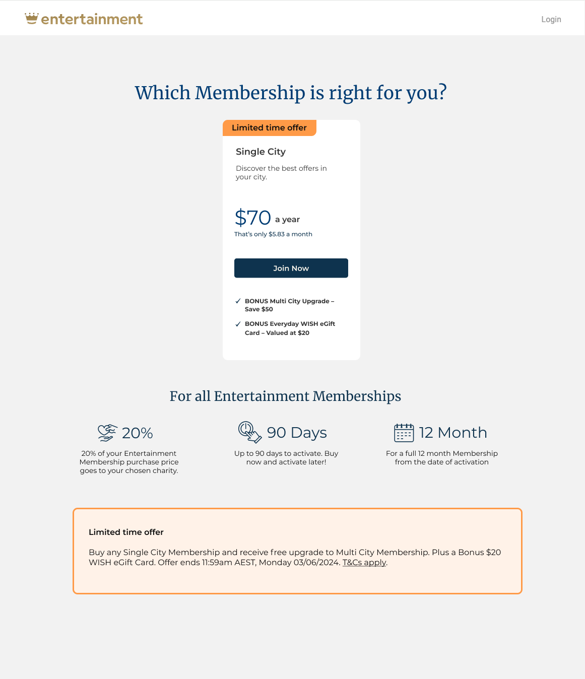
- Reduced cognitive load by hiding the $120 Multi City product card, since the $70 Single City will automatically be upgraded to Multi City.
- Emphasized the value of the Membership by adding the line “That’s only $5.83 a month” under the $70 price mark.
- Highlighted the bonuses by presenting them in concise point form under the Join Now button.
- Created interest by summarising the Membership features using iconography.
- Reduced distraction by removing the payment methods section along with the logos. These should be moved to the next step, which will be the checkout page.
Round 3 mockup – Final:
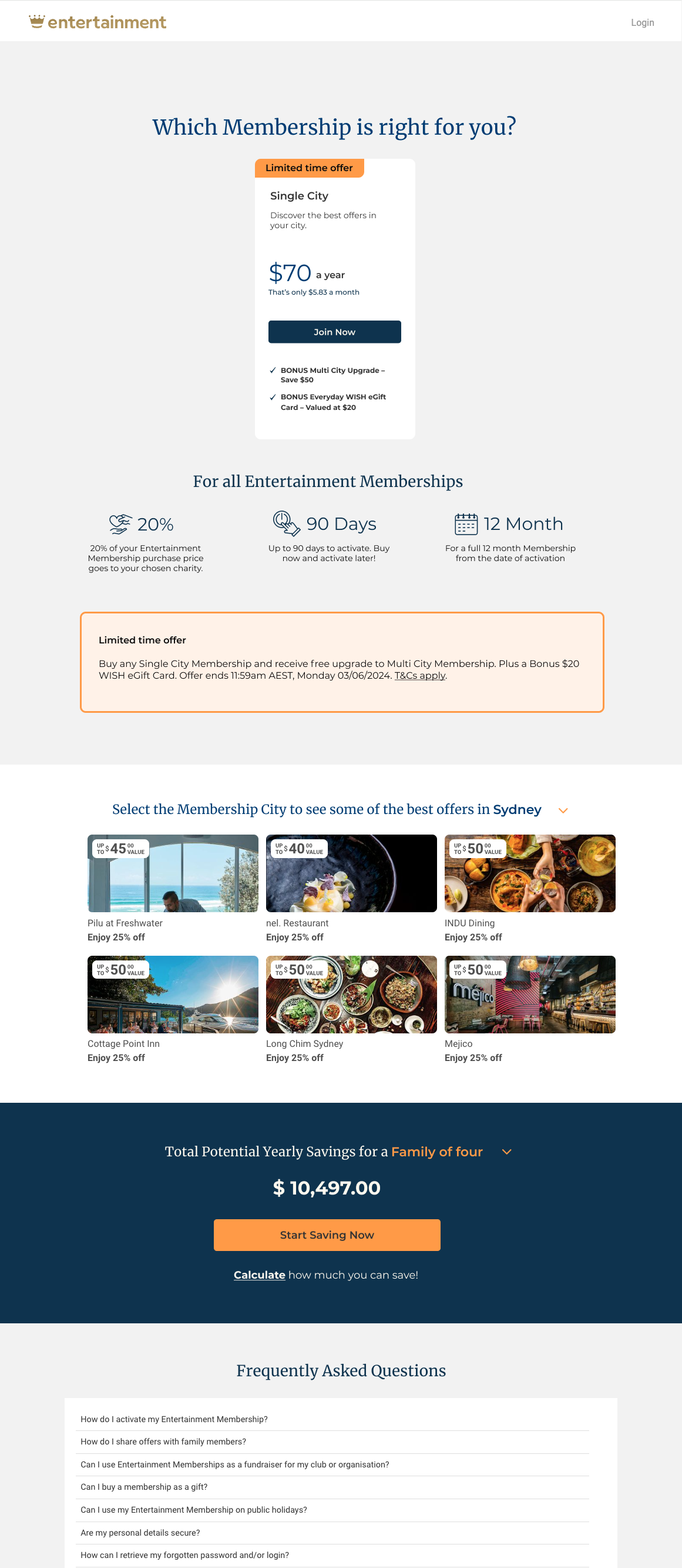
To tackle the pain point of users not understanding the value of the Entertainment Membership, I added the following sections underneath the product card(s) section:
- A widget to display the top 6 offers relevant to the user’s city.
- A display of potential savings a user can achieve based on their family size.
- A Frequently Asked Questions section to address any uncertainties or confusion about the Entertainment Memberships.
Final Product
Takeaways
Impact:
Our visitors are staying in the webpage longer by 20 seconds and the bounce rate has significantly reduced.
What I learned:
I learned that it is important to put yourself in the customer’s shoes to focus on what is needed on the webpage. If there is a lot of information to present, breaking it down into sections and making use of iconography and images can significantly help users digest the information and achieve better results.

